It can be a bit overwhelming designing a great logo – I mean, no pressure; it just has to represent your business and everything you stand for. So how do you do that, exactly?
We’ve put together a fast five of design trends for logos in 2015, so you can make sure your marketing is fresh, professional, and doesn’t resemble something from the dark ages.
1. Flat Design
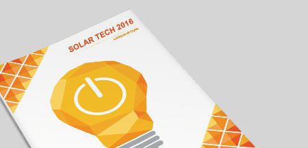
Hop around some graphic design blogs for about two seconds and you’re sure to encounter the term “flat design” at least once or a hundred times. It’s the latest trend in design and hence should be a big deciding factor in creating your logo.
Basically, it means stripping back all the layered textures, shadows etc. and making something that has a more two dimensional feel. Design has reinvented the wheel that many times over the years, that flat design is a way of bringing it all back to basics.


![]()
2. Dynamic Logo Sets
If you’re going design a killer logo, why just settle with one? Businesses (and customers) can get tired of seeing the same old logo day in and day out, which is where logo sets come in to spice things up.
Based around one centric design, you can mix things up according to the marketing campaign you’re running, or the season of the year, or whatever it is inspiring you!
![]()

3. Fonts – Custom Letterforms, Calligraphy & Script
There’s no “one font to rule them all” when it comes to design, but there are three winners you can look for when it comes to the logo trends of 2015:
1. Custom Letterforms
2015 is seeing a throwback to the golden age of customised letterforms. Rather than relying on mass produced Helvetica logos, designers are increasingly testing the boundaries with their own custom fonts.

2. Calligraphy
Though this style has been around for a very long time, calligraphy is coming back in as a popular choice for logo fonts. It obviously depends very much on the type of business you have as to whether it will suit, but when it works, it really works.
![]()
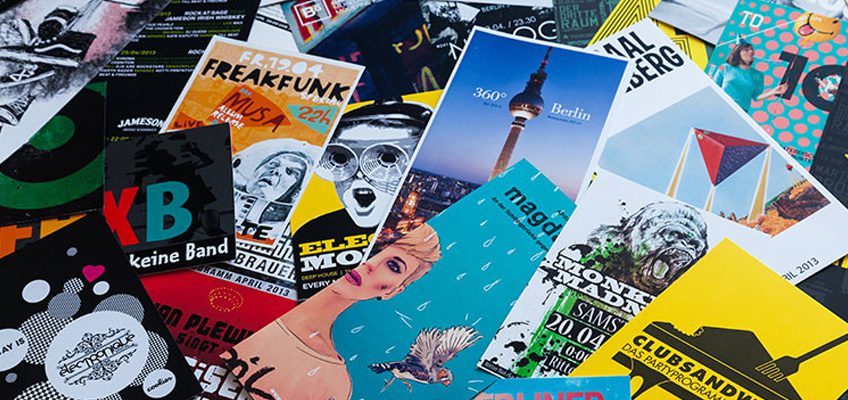
3. Script
Script logos have arguably be around for eons, but they’re getting even bigger and more popular in 2015. All aboard the script font train!

4. Negative Space
Despite the name, there’s nothing negative about some good old use of the negative space. Ronan Keating’s line that “you say it best when you say nothing at all” has never been more applicable.

5. lowercase
Capital letters: who needs them? Not the design world. Love them or hate them, lowercase logos are proving to be a huge trend in 2015. Goodbye, proper grammar.
![]()
![]()
Now that you’ve got the tools to get your logo looking sharp, why not print some marketing material to match? Have a chat to Printroom about all of our premium (but cheap) printing services – we’ll sort you out!