Get your business card design right this new year
The year-end holiday season may be perfect for taking off and winding down, but it is also a great time to prepare for the new year. In fact, now is the perfect time for you to get your business cards sorted, so that you are primed and ready for all the new networking opportunities at the start of the year!
Whether you are designing brand new cards, or looking to update old ones, here are some things you should pay attention to when working on your business cards:
Font
Tiny fonts are hard on the eyes, so ensure that the letters and numbers on your card are easy to read. As a general rule, the minimum font size used should be 6 pt. If you are not sure whether the font size is too small, try asking a few people if they could easily see what your card says. Also, pay attention to colour contrast. Avoid using a font colour that is too light or too close to the colour of your card.
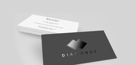
Glossy paper may not be the best choice for a business card design, because it can be hard to write on. Some people like to scribble notes about your business when you hand out cards at trade shows or networking events to help them remember you better. It would be better to pick a high quality matte card stock, that will not easily bend or tear. Stay away from paper stock that is too thin or flimsy.
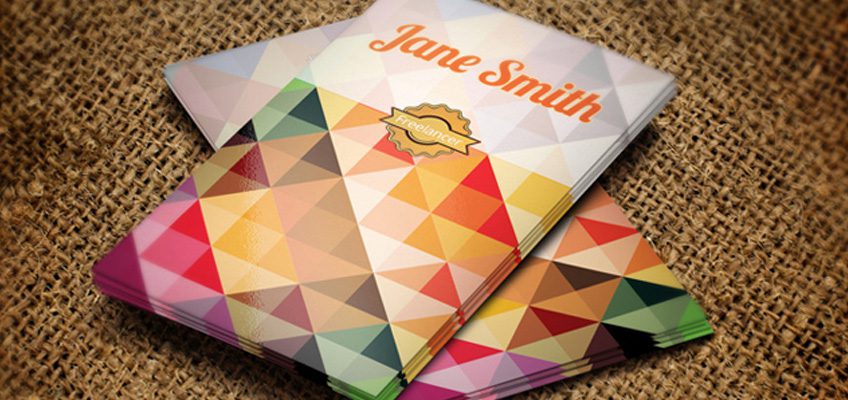
Branding and design consistency
Showcase your logo and brand colours on your business card. The overall design should also be consistent with how your website, store or products look. This makes brand recognition easier, and will also help customers to quickly associate your business with key services.
Space usage
Do not attempt to squeeze in too much information on your business card. A card with too many words and images can be quite frustrating to look at, and may leave a bad first impression. Make use of white space. Leave room around so that your card is easier to read. And don’t forget that you can always use the back side of the card too.
Trims and bleeds
The ‘trim’ edge is the final dimension that the card will be cut to, and ‘bleed’ is printing that goes beyond the trim edge. Always leave an additional 3mm bleed wherever design elements touch the edge of your trim dimension, to avoid any white gaps. If you have background artwork or colours, they should extend into the bleed area.
Contact details
The main use of a business card is to let people know how to reach you, so make sure the most important details are there: your business name, your name, your job title, your phone number, and perhaps your business address. It is also good to include your email address, business website, and social media handles. Not everyone likes to talk on the phone, so remember to add multiple channels for people to contact you.
Spell check
Typos and grammatical errors put people off more quickly and more often than you realise. Potential customers and clients may feel that you are negligent, careless, or unprofessional if they see such mistakes on your card. Always check and re-check every detail before sending your design to be printed.
Start the new year with new business cards that tick all the right boxes! If you need some help, you can always check out Printroom’s business card printing services.